Throughout this unit I have researched different artists which contribute to landscape photography this can be seen throughout this blog and the personal study, some famous photographers such as Ansel Adams and some 'newer' photographers such as Alex Nail. This has allowed me to research and experiment with old and new experiments such as HDR, black and white photography and selective colour. As part of this unit I have explored another photography topic which can be linked to landscape photography, street photography. I felt this topic would be extremely useful to experiment with as this creates more interesting photographs and avoids constantly capturing rural areas, like most landscape photographers. This also allowed me compare the different results due to the contrasting differences in terms of location and the aspects that contribute to these two different genres.
This unit required a vast amount of research due to the popularity and the importance of this topic. This allowed me to research the development of photography and how this has impacted landscape photography as of present, such as experimental results e.g. double exposure and HDR. When researching I discovered that HDR was a massive part of landscape photography, which Ansel Adams became an iconic photographer for. Colour is also another important feature in landscape photography, the research evidences that 'older' artists use black and white photography whereas 'newer' artists tend to work with colour more. Therefore this shows how photography has developed over time and being an important aspect of the final photograph. As part of this unit I have experimented with colour, black and white photography, colour and selective colour. This allowed me to compare the differences, I found black and white photography extremely interesting due to the tones which can be created within this effect. However I found using colour and experimenting with the HDR effect the most interesting experiment within this unit and I feel this was the highlight of this unit.
Towards the end of this unit I decided to present a more interesting and creative piece, this was achieved by looking at artists such as David Hockney. I felt this final pieces work well as this shows the development I have made throughout this unit by experimenting with different techniques, such as colour, location and composition. I wanted the final pieces to be different compared to other artists therefore this resulted in the David Hockney technique rather than submitting a static photograph I used a more creative approach.
Monday, 11 May 2015

Monday, 20 April 2015
Final Piece Evidence
The screenshots shown within this post display how the final pieces have been created, evidencing the different stages.

To begin the process I used the grid option in Photoshop as this would allow me to cut up the different parts accurately. I decided each piece would be cut up 4x4 as this would be easier to put the pieces together due to a even number being used and preventing any complications. Therefore I opened two documents, one being the photograph and the other being a blank document. This would allow me to use the selection tool to select the individual pieces and then transfer them to the blank document.

I also used the grid option in the blank document so that I could arrange where the pieces could be placed within the document. The screenshot above shows that several pieces have been transferred to the blank document. This process would continue until all the pieces have been transferred and placed in an appropriate place within the document.

This shows the development of the final piece, displaying all the pieces have now been placed within the blank document. As well as this, it also evidences that the drop shadow effect has been used on half of the pieces within the document. This was a crucial feature as it would allow the pieces to further stand out from one another creating a 3d effect.

This screenshot shows that all the pieces now contain the drop shadow effect giving the photograph a more dynamic effect compared to the first outcome which showed a static photograph.

This evidences that each layer within the document contain the drop shadow effect.

This screenshot shows that the photograph has progressed even further as the multiply option has also been used for each layer. The multiply feature allows each piece of the photograph to multiply over one another, which mixes the colours together. Thus making different shades due to these being combined.
Friday, 17 April 2015
Final Piece
For my final piece I decided to create a series of photographs using the David Hockney technique in order to present them in an more interesting and creative way. To decide on which photographs I would use, I decided to use 2 street photographs and 2 rural photographs as this would should the differences in contrast such as the colours and the elements which form part of the photograph. As well as this I decided to use the photographs which I thought were most successful within this unit.

This is the first piece which will contribute to the final piece. This piece is one of the street photographs, I used this as I felt this was extremely successful in terms of composition and colour. I thought this would work well with the David Hockney effect too due to overlapping the content of the photograph such as the buildings and the people within the foreground. Overall I think this photograph works well in this technique and to form part of the final piece, especially as this further enhances the colours within the photograph.

This is the second street photograph used as part of the series for this final piece. This photograph is different from the first street photograph in terms of location and the elements this focuses more on the street and the buildings whereas the previous photograph uses more movement due to the people and the cars captured. I felt that this photographed was extremely successful in terms of composition and colour and this shows a range of different elements, providing a broad colour palette. I also felt that this highlighted the urban city well and would contrast the rural photographs extremely well. Overall I think this photograph works well in this technique and this is mainly due to the content of this photograph such as the buildings, roads, signs and the car in the foreground.

This is the third piece created for the final piece, this photograph is a rural landscape, thus contrasting the previous two street photographs in terms of content and colour. I think that this photograph works well due to the composition and the colour scheme used and the lighting. I think this photograph works well in this technique as the photograph has been cut up easily, displaying an interesting and creative photograph compared to the original photograph. The overlapping areas also create more tones within the colour due them being combined together, thus highlighting different areas of the photograph.

This is the final piece within the series of photographs used to present the final piece for this unit. I think this is the most successful photograph out of the series of photographs due to the different colours and the lighting which highlights different parts of the photograph, further enhancing the colour of the photograph. I think this technique works well with this photograph due to the composition of the photograph, thus the squares create tones within the photograph, highlighting different areas of the photograph, making this stand out even more, especially compared to the original photograph.
Sunday, 5 April 2015
Final Piece Idea - David Hockney

Previously I had researched Szymon Roginski & Kasia Korzeniecka work and considered this a technique to use when presenting my final pieces. However when trialling this technique I realised that I wouldn't have enough time to use this technique as well as possibly printing the outcome. Therefore after ruling out this idea I came across David Hockney's work, after viewing his work I thought that this would be a good technique to combine with the work I had done. This technique is similar Szymon Roginski & Kasia Korzeniecka work due to the abstract aspect, however this technique doesn't require a huge amount of time, thus giving me enough time to use this for my final piece. Therefore this resulted in using this idea for my final piece in order to present my work. This would involve changing the photographs to have a similar abstract style, which would result in cutting the photographs in to different pieces and then overlapping the elements to recreate the original photograph. This allowed my final piece(s) to contain a more modern appearance as well as adding a creative aspect to them rather than just present several static photographs which have been taken. I also felt that this was relevant as the majority of artists I have researched throughout this course have just presented the final photograph and haven't considered changing the way in which it is presented.
Saturday, 4 April 2015
Szymon Roginski & Kasia Korzeniecka - Final Piece Idea

During this course I came across the artists Szymon Roginski & Kasia Korzeniecka, these have worked together in order to create the pieces which can be seen within this post. After viewing several different pieces of their work I thought that this would be a good technique to when presenting my final piece(s). This would involve cutting the photographs up and then applying a drop shadow to ensure that the pieces contain the 3 effect shown within this image. This also may involve drawing out cube and then transferring the cut up pieces of photograph to these individually.

This is another piece which I came across when researching the artists, Szymon Roginski & Kasia Korzeniecka. This photograph uses a slightly different approach as this displays the photograph on multiple hexagons, varying in size. Again, this would also be an interesting technique to try out, especially when presenting my final pieces as these could potentially be printed out, allowing me to arrange the hexagons in the correct order, This would be more interesting than printing an framing an image.
Friday, 3 April 2015
Polaroids

The photograph is a representational photograph as this capture different objects such as the bridge, road, trees and the buildings. The photographs quality isn't as good as a digital camera however there is a reasonable amount of detail within the photograph and the quality is reasonable as you can make out objects such as the leaves. Due to the quality of the image this gives an older feel which is mainly due to the lighting and the fact the objects aren't in focussed. The photograph does contain a wide colour palette due to the different objects located within the area but obviously the colour isn't as bright due to the exposure.

The photograph shown above didn't appear as well as the previous photograph and this is because of the weather condition as when processing this image it began raining. This of course did have an affect on the overall outcome as the photograph was processing in the rain. The evidence of this can be seen by viewing the small white dots which appear mainly area the building area. It is also noticeable that the colour of the sky has a tint of pink which again this is due to the photograph developing in the rain which made the colour run. However despite the mistakes made within the photograph I don't think they massively impact the photograph as the colour within the road and buildings can still be seen. The colour for this photograph is darker than the previous photograph and again this is due to the weather conditions at the time of taking the photograph.

The photograph shown above didn't develop as well as expected due to the weather conditions, as of this point the conditions were at its worse. Therefore more light was needed in order for the photograph to develop correctly but the lighting conditions didn't help in terms of capturing the photograph compared to using if a digital camera was used. The lighting for the photograph has had a massive impact in the overall photograph as the only part which doesn't appear dark is the middle of the road which allows different parts of the road to be highlighted, showing the current weather conditions e.g. the puddles.

This photograph didn't turn out as well as expected due to the rain affecting the overall outcome thus making the photograph darker than expected. The rain has also affected the photograph in terms of the white dots appearing on the photograph. There are parts of the photograph where the rain didn't particularly impact the outcome for example the foreground of the wall. The photograph may benefit from being edited digitally such as using Photoshop to adjust to levels of exposure to get a better view of the area captured. The photograph uses a a limited colour palette however the lightening doesn't do the colours justice, the different colours may show up better if the levels are adjusted in Photoshop.

This photograph also didn't turn out as well as expected due to the current weather conditions which also impacts the overall lighting. The photograph didn't have enough light to allow it to develop correctly which explains the darkness of the photograph. The photograph has a lack of detail due to the amount of light included within the photograph. However due to the white which appears at the top of the photograph this allows the branches on the tree to stand out mainly due to the contrast which appears within the colours. The aim of this photograph was to capture the scenery in the current location although as explained this was unsuccessful.

Again, this photograph hasn't developed as well as expected due to the weather conditions at the time and not enough light was exposed to develop the overall photograph. The photograph does shows where the rain has affected the photograph, this is evident due to the two white dots which appear near the top of the photograph. The photograph is extremely limited in terms of colour as this hasn't developed correctly due to the amount of light used to develop the photograph. However you can see that the photograph has focused on capturing the scenery in the location by capturing the trees.
Overall the experiment didn't have a successful outcome as only two photographs developed correctly. Therefore when using a polaroid camera in the future the weather conditions will be considered as this has prevented the photographs from developing correctly.
Saturday, 3 January 2015
Double Exposure Own Photograph

The purpose of this experiment was to try and incorporate double exposure, similar to Markus Hartel's work, instead of using a window reflection I used Photoshop to create the double exposure. To do this I combined the layers and used the multiple tool so that they would overlap each other giving the double exposure effect. Overall I think that this technique works well as the original photographs are similar to one another, both containing several buildings which creates an interesting effect. This photograph uses a broad colour palette with a wide range of colours used, the most colours are found within the one photograph however when combined this creates a wider range of colours. The photograph contains a variety of different lines, mainly found within the buildings.

Friday, 5 December 2014
Preston Utley

Preston Utley is a photographer who specialises in wedding photography based in Denver. He uses both colour and black and white when capturing photographs, varying his work. However Utley doesn't just focus on wedding photograph he has also captured a number of photographs elsewhere focusing on a different subject matter, e.g. New York.
 The aim of this photograph is to capture the natural environment by not alarming people that the photographer is actually taking that photograph of them. Therefore this photograph captures different expressions and movement which the photographer aimed to do. As well as this the photographer is always able to capture the surrounding environment and portray peoples day to day routine. This photograph makes use of the different lighting options such as the natural light from the sun, traffic lights and lights found within the buildings. The colour palette for the photograph is very broad as the photograph contains a variety of different colours such as yellow, blue, red, green, orange, white and black. Therefore contrast can be found within this photograph due to the light and dark colours used. The light within the photograph helps to create shadows which makes use of the white space available and also gives the photograph more depth.The photograph not only captures the people within the area but also captures the urban setting which contains buildings, cars, signs and advertisements.
 James Maher

James Maher is a studio photographer situated in New York and this is where he focuses on capturing photographers. His passion for photography has also given him the opportunity to write about street photography, portraiture as well as the business of photography.

This photograph captures the movement within the street due to the cars and the people included within the scene. Due to the amount of people within the street the photograph is very busy and there is very little white space. The photograph portrays the atmosphere of the street by showing the amount people, making the street busy. The majority of the white space included is located in the foreground where there is hardly any people. The colour palette for this photograph is also very broad and this is due to the amount of content included such as people, buildings and objects. The different colours provides contrast between the light and dark colours an example of this being the green found on the bin against the grey pavement. There are several different lines found within the photograph, the main on being the lines found on the buildings which eventually turn into a vanishing point.
Tuesday, 2 December 2014
Exploring Urban/Street Photography - Markus Hartel
After exploring rural landscapes for a reasonable amount of time I decided to explore urban landscapes to further my research. When researching I realised that this type of photography incorporates street photography but this depends on the location such as New York.

Source: http://www.markushartel.com
This black and white photograph incorporates street photography due to the people included within the photograph. Even though the colour palette for this photograph is very limited it has tonal values which gives the photograph a sense of depth. The light within this photograph highlights different areas of the photograph and due to the weather conditions this gives a reflective glare. This photograph does capture slight movement due to the people walking, especially on the right side.

Source: http://www.markushartel.com
This photograph captures the reflection of the buildings window in which the photographer captured the photograph. This reflection creates a sense of movement, even though there is already movement due to the traffic the reflection gives a false sense of movement as it appears faster than it is. There is a lack of colour due to the photograph being captured in black and white. However I think that black and white suits this photograph due to the reflection, I think that if it was captured in colour then perhaps this wouldn't be as effective as it being captured in black and white. As well as this I think the use of black and white gives the photograph a dynamic feel and appearance. The photograph contains tonal values within the photograph and due to the light this helps creates shadows which can be found on the road.
Monday, 1 December 2014
Editing

Original Photograph
This photograph was taken during the early hours of the morning which allowed me to capture the mist, and this was the aim of the photograph. Due to the photograph being captured during the morning there wasn't much light therefore the photograph is very dark and dull. However the mist captured brings out the trees due to the contrast in colour.

Edited Photograph
This photograph is the edited version of the previous one shown above. By editing this photograph it has made the overall photograph more vivid by altering the exposure. This makes the photograph more dynamic especially in the grass area due to the shadows and tones. As the exposure has been altered this allows more contrast within the photograph due to the different colours. This also gives more depth to the photograph. The aim of this photograph is to capture the trees with the mist behind them while capturing the rest of the scenery which has been achieved by capturing the photograph central. The photograph also captures track marks within the grass which suggests movement but also gives the photograph detail.

Black and White Photograph
I decided to use black and white for this photograph as I think it is appropriate due to the location. This photograph may be very limited in terms of colour however due to the tones and shadows used within the photograph this allows the photograph to stand out and have a dynamic effect. The aim of the photograph is to capture the mist from behind the trees and due to the limited colour this helps the mist to stand out. The background of the photograph isn't in focus which overall works due to the mist cover the majority of the background scenery.


Sunday, 30 November 2014
Own Photograph - Alex Nail Emulation

The purpose of this photograph is to capture the mist in the background while capturing the tree in the foreground. I used Alex Nail's work as a reference in order to try and emulate his work by changing the scene but incorporating the same style, capturing the mist. When capturing this photograph I decided to capture the sun behind the tree in order to highlight the mist in the background and overall I think this works well. The position of sun and the mist suggests that the photograph was taken early in the morning. Due to capturing the sun behind the tree this allows it to highlight parts of the tree and the mist as well as creating shadows within the photograph. The darkness of the foreground also allows the colour in the background to stand out and allow the parts it has highlighted to stand out. This also allows for contrast to appear within the photograph due to the dark foreground and the light background.The colour palette within this photograph is very limited due to the overall lighting. If more light was provided then the colour palette would be widened.


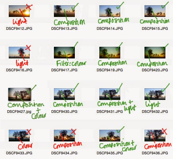
This shows the contact sheet with all the photos which were taken in order to achieve the final result.

Alex Nail - Mist
Alex Nail is a landscape photographer who began photography in 2006 by capturing different photographs in Dartmoor. Alex travels to different location to capture new scenes and uses the light in their photographs to get the best outcome. As well as capturing photographs Alex also produces articles based on photography for magazines.
When researching Alex's work I noticed that some photographs they have captured includes mist and thought that this would be a good experiment to try out. Therefore I have used the images below as a reference when producing my own photographs and will consider the composition in which Alex has used.

This photograph has a limited colour palette due as the only colours used are green, blue and white and this is due to the amount of natural light within the photograph. However the limited colour palette helps to capture the mist within the photograph and this is the aim of the photograph. The aim of this photograph is to capture the mist amongst the scenery. The mist gives a sense of movement due to the positioning of the mist as it is captured in different locations.

This photograph uses a restricted colour palette due to the photographer choosing to capture it in black and white. The aim of this photograph is to capture the mist which appears mainly in the background. Due to the amount of light this has produced soft tones within the photograph and almost giving the photograph a painting appearance. Even though the photograph has a restricted colour palette there is a variety of tones used within the photograph. Lines are an important feature within this photograph as this helps give the photograph depth and also helps the mist to stand out as this is a prominent feature.
Own Photograph - Board

To capture this photograph the camera settings have been adjusted to advanced effects as this enables the dark edges to be created. The colour palette is very subtle and the colours are repeated constantly throughout the photograph this is mainly due to the subject matter. This photograph has also been taken during the early hours of the morning and the lightning provided helps to create shadows. The main focus of this photograph is to capture the board and the surrounding area. The board is the feature which is in focus the most whereas the background which contains the trees isn't in focus. This photograph also portrays the atmosphere within the area due to the space which suggests quietness and the movement of the water portrays stillness.

This shows the contact sheet for this photograph and indicates which photographs which will be used and which will not be used. The photograph with a * next to it indicates that this photograph will be used however it will need further editing in order for it to be suitable for this project. This is due to the lighting however once the exposure levels have been adjusted this shouldn't be a problem.
Monday, 10 November 2014
Polar Panorama Effect

For this experiment I have used my own photographs then experiments with using the polar panorama effect. These photographs were produced by editing the original photographs in Photoshop in order to get the panorama effect which was simple to do and no editing to the photographs was done. The colour palette for this photograph is limited due to the surrounding area however the colours used make the stone arch stand out. The detail in the arch is also sharper as this effect shows the significance of the stone arch due to the size comparison. The lighter and darker tones of the photograph also help with the detail of the arch I also think it gives a different effect compared to a static image with no effects.


Saturday, 8 November 2014
Panoramic Reference
By researching panorama photography this enabled me to further experiment and develop different photographs rather repeating techniques or using similar techniques.

http://www.incrediblethings.com/art-design/a-new-spin-on-landscape-photography/.
To further experiment with photographs I started by looking at panoramic which will enable me to use my theme landscape. This will involve taking landscape photographs and then transforming them into panoramas. The photograph shown above uses a range of subtle colours due to the photograph capturing a wide view of the location.

http://www.digitalcameraworld.com/2012/11/01/polar-panoramas-shoot-and-stitch-360-degree-pictures/3/
Again this is another example of a panorama photograph which has been created by taking and landscape photograph and then transforming this into a panorama. The colour palette is often repeated throughout the photograph and due to this it is very limited in terms of a variety of colour. The photograph itself is slightly distorted in the middle as it expands. Light has been captured within this photograph which can be found on the buildings which creates different tones.
Monday, 3 November 2014
Filters

I started experimenting with filters as this gives different effects on the overall image as show in these photographs. The filters have given a darker feel to the photograph by changing the colour of the lightening such as the sky. The main focus of this photograph is to capture the arch and by trying to capture it in the centre. The colour palette used within the photograph is minimal and this is mainly due to using filters as this filters out the colour. However despite this I feel that it gives a dusky effect and overall works well due to the location of the photograph. The background isn't focused therefore this helps to show the importance of the arch and allows it to stand out from the background.

This photograph has also used a filter which also gives the photograph as dusky effect. The composition of this photograph is poor due to the position it was taken at, which I think does impact the overall photograph in terms of framing. However the photograph was taken on a slope which also effects the composition. The photograph isn't as clear as it could be but I think the filter has impacted this.
Sunday, 2 November 2014
Double Exposure

This photograph uses a range of different colours and tones which is mainly due to the double exposure effect has it captures multiple photographs. Due to the location I think that the double exposure works well as it provides the mist captures in one photograph to be placed behind the tree. The main focus of this photograph is the tree which is also more focused compared to the rest of the objects within the photographs. The aim of the experiment is to combine the photographs to create a different effect and with more content this is easily achieved. The photographs combined allow more mist to be included. Overall I think this photograph works the best out of the three images shown within the post.

Double exposure has been used to create this photograph and overall it works well due to the objects combined. The colour palette is very subtle which is due to the photographs being combined as well as the location they were took. The tree is the most prominent object within the photograph due to the colour which contrasts with the arch and the tree being in the foreground.

This photograph also used the same technique of combine two images together to create double exposure. Combining the two images allows the castle to be included within the photograph as well as including the tree and the scenery from the other photograph. The colour palette is very limited and the colours used are subdued due to the filters used one on of the photographs. The double exposure almost creates a silhouette of the tree and this helps to create different tones. The tones used allow the tree to be highlighted when overlapping the castle.
Subscribe to:
Posts (Atom)